Project Overview
The problem
Many people around the world want to help and support Ukraine against Russian Aggression. A lot of the donation websites are crowded with information and programs that can confuse and doesn't have easy access to donate fast and easy for Ukraine.
The goal
Design Help Ukraine website to be user friendly, easily, secure and fast donate money for Ukrainian people.
Summary
User research
I conducted user interviews, which I then turned into empathy maps to better understand the target user and their needs.
I discovered that many target users usually donate for charity through websites, especcially now. Many of them want easier and faster ways to donate. However, many charity websites are overwhelming and confusing to navigate and payment process, and not all of them they could trust, which frustrated many target users.
Pain Points
1 NAVIGATION
Charity website designs are often busy, which results in confusing navigation
2 Banking systems
Coudn’t find right banking system options for donation.
3 PROCESS
Too many steps to complete donation process
Persona: John
Problem statement
John is a busy business owner, who needs to easily, secure and fast donate money for Ukrainian people because he wants to help people from Ukraine to survive the war.
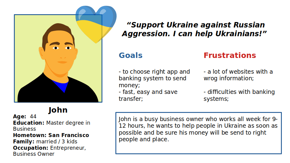
Persona: John
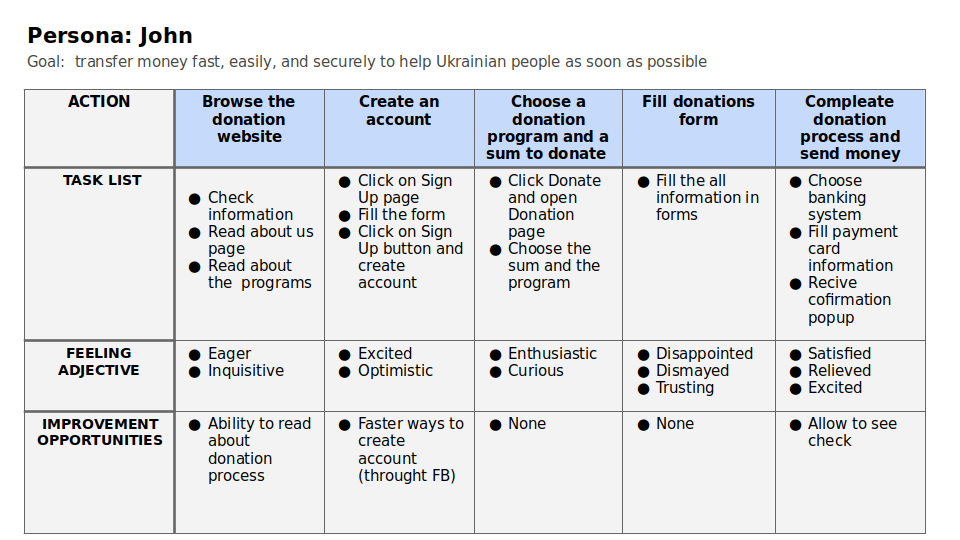
User journey map
Goal: transfer money fast, easily, and securely to help Ukrainian people as soon as possible
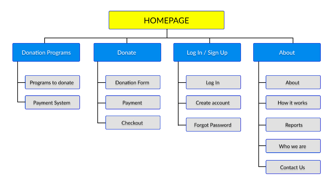
Sitemap
Create sitemap
Difficulty with website navigation and donation process were the primary pain points for users, so I used that knowledge to create a sitemap.
My goal here was to make strategic information architecture decisions that would improve overall website navigation and user flow. The structure I chose was designed to make things simple and easy.
wireframes
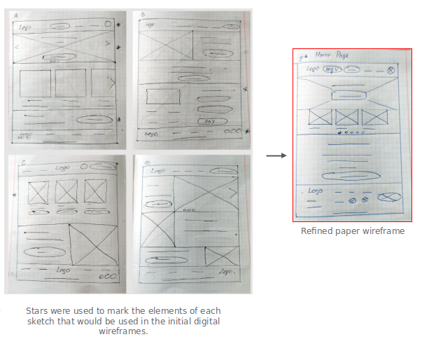
Paper wireframes
Next, I sketched out paper wireframes for each screen in my app, keeping the user pain points about navigation, banking systems, and checkout flow in mind. The home screen paper wireframe variations to the right focus on optimizing the browsing experience for users.
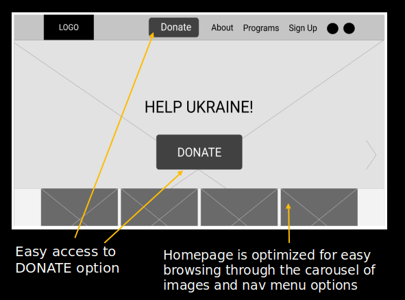
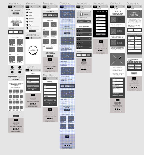
Digital wireframes
base screen design
Moving from paper to digital wireframes made it easy to understand how the redesign could help address user pain points and improve the user experience. Prioritizing useful button locations and visual element placement on the home page was a key part of my strategy.
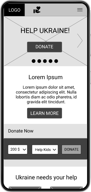
Digital wireframes - mobile design
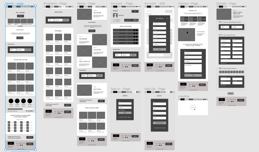
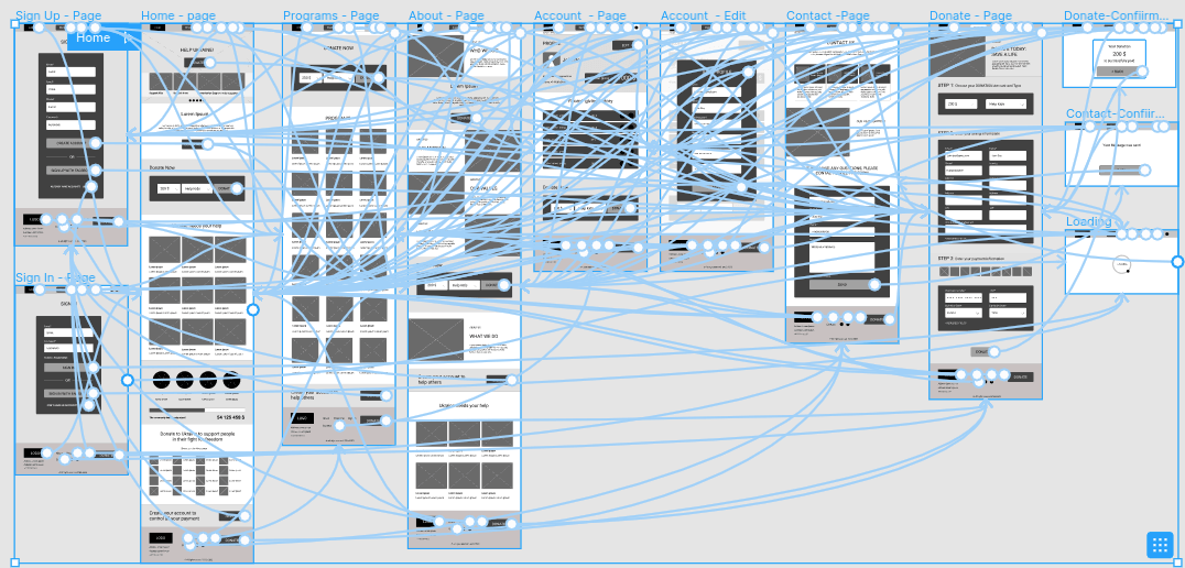
Low-fidelity prototype
To create a low-fidelity prototype, I connected all of the screens involved in the primary user flow of moving between pages, sign in /sign up pages, creating a profile page and editing it, and donation page with 3 steps of the donation process.
Usability study: parameters
1 Study type:
Unmoderated usability study
2Location:
United States, remote
3 Participants:
5 participants
4 Length:
20-30 minutes
Usability study: findings
These were the main findings uncovered by the usability study:
Create account
Users need faster way to register account
Donation flow
Users were confused about choosing and navigating banking system icons.
Accessibility
Users need multiple language options to choose their language for better understanding and user experience
Mockups
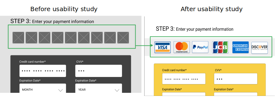
Refining the design
To make the donation flow faster for users, I added the most popular banking system icons with text bigger.
Mockups
Refining the design
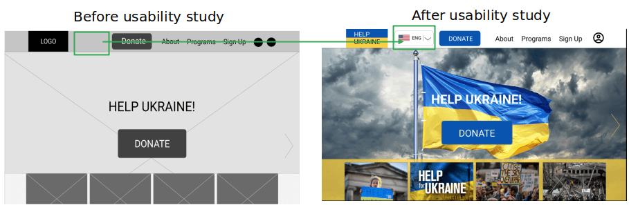
Based on the insights from the usability study, I made changes to improve the site’s accessibility and add multiple language options. This allows users all around the world to use this site and understand the content of the site.
Mockups
Refining the design
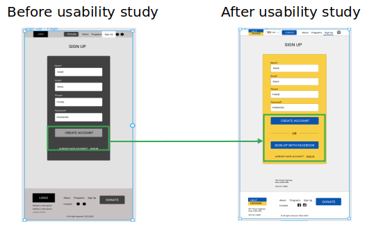
To make creating an account faster for users, I added the SIGN UP WITH FACEBOOK button
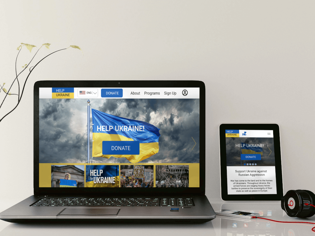
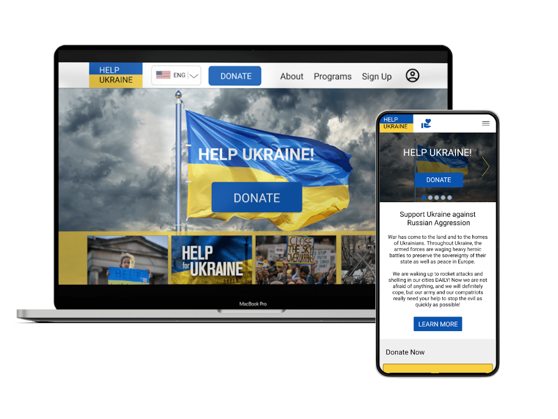
Mockups: Original screen size
Desktop High-fidelity prototype
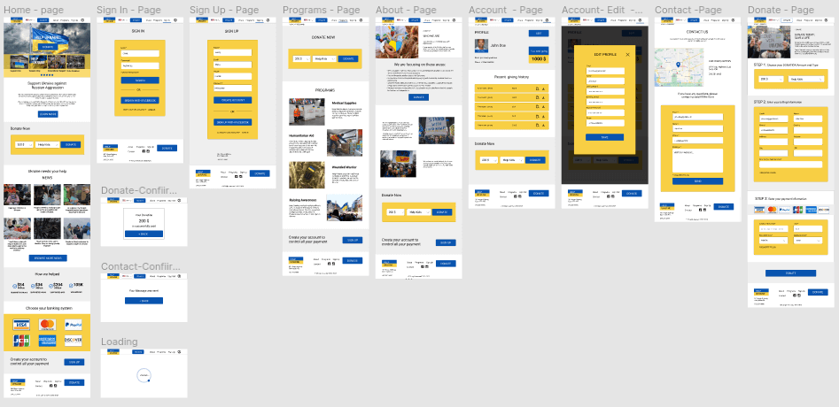
My hi-fi prototype followed the same user flow as the lo-fi prototype, and included the design changes made after the usability study.

Mockups: Mobile Design
Mobile High-fidelity prototype
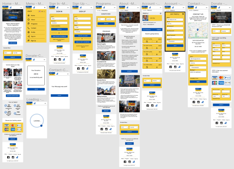
My hi-fi prototype followed the same user flow as the lo-fi prototype, and included the design changes made after the usability study.
View the HelpUkraine high-fidelity prototype for mobile devices
Accessibility considerations
1 I used headings with different sized text for clear visual hierarchy
2 I used landmarks to help users navigate the site, including users who rely on assistive technologies
3 I designed the site with alt text available on each page for smooth screen reader access
Takeaways
Impact
Our target users shared that the design was intuitive to navigate through, more engaging with the images, and demonstrated a clear visual hierarchy.
What I learned
I learned that even a small design change can have a huge impact on the user experience. The most important takeaway for me is to always focus on the real needs of the user when coming up with design ideas and solutions.
Next Steps
1 Conduct follow-up usability testing on the new website
2 Identify any additional areas of need and ideate on new features