Project Overview
The problem
Many people struggle with the diseases, some lose their ability to work and they don't have any money to get any medical help and treatment. But it doesn't have to be this way. Even if people can't afford to pay their medical bills because they don't have any income or for other reasons they should have the opportunity to get free medical treatment easily and find the right programs or centers with free treatment.
The goal
Design an app and website that will help people without the income to get free medical treatment easily and improve their health.
Summary
User research
I conducted user interviews, which I then turned into empathy maps to better understand the target users and their needs.
I discovered that many target users are users who need free medical treatment for themself or their kids with no income. All of them want to get information about free medical treatment easily and in one place and even book an appointment at a medical center online. However, not all apps and websites combine those two options.
Pain Points
1 SEARCH
Difficult to search and find the right program for the user
2 INFORMATION
Overwhelming with a lot of information in one place
3 PROCESS
Can't book an appointment for the medical program online
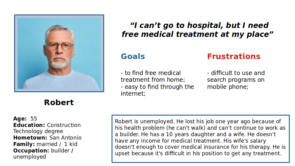
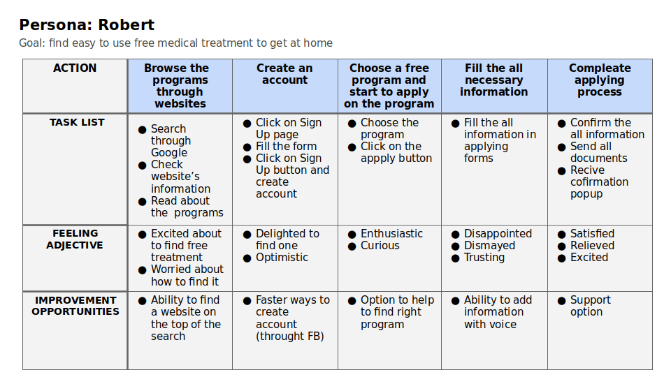
Persona: Robert
Problem statement
Robert is unemployed, disabled person with no income who needs a free medical treatment from home, because he wants to improve his health and find a new job
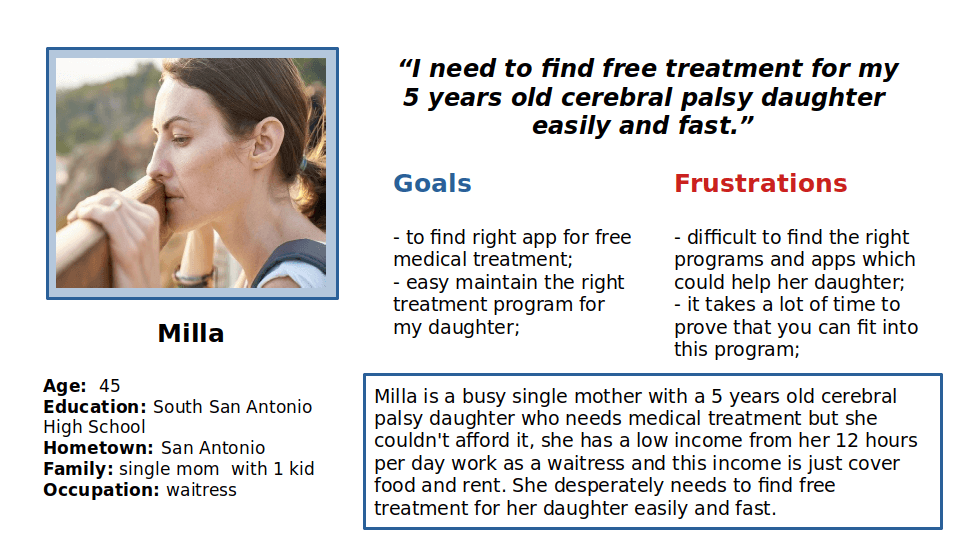
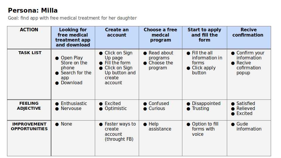
Persona: Milla
Problem statement
Milla is a busy single mom of 5 years old cerebral palsy daughter and waitress who needs to find free medical treatment for her daughter fast and easily, because she needs free medical help as soon as possible.
User journey map
Ideation process
Ideation
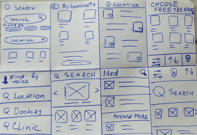
Crazy eight
I did a quick ideation exercise to come up with ideas for how to address gaps identified in the competitive audit. My focus was specifically on how easy to search and find free medical programs
wireframes
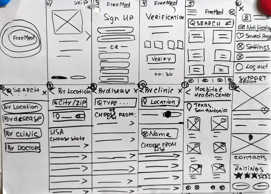
Paper wireframes
Next, I sketched out paper wireframes for each screen in my app, keeping the user pain points about search, information, and booking flow in mind. The home screen paper wireframe variations to the right focus on optimizing the browsing experience for users.
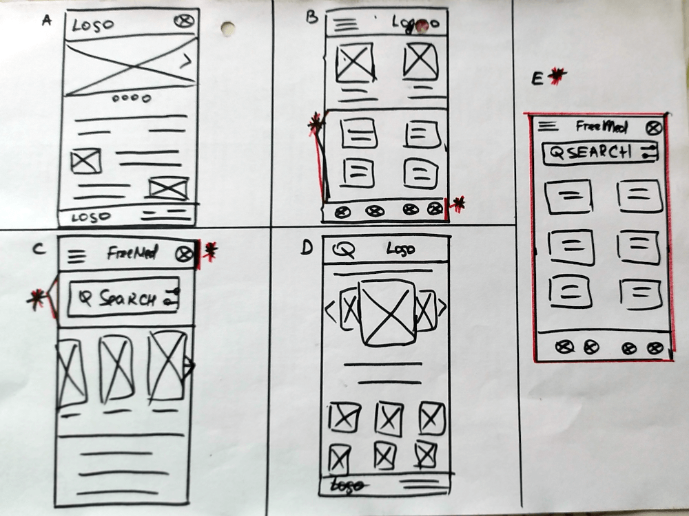
Digital wireframes
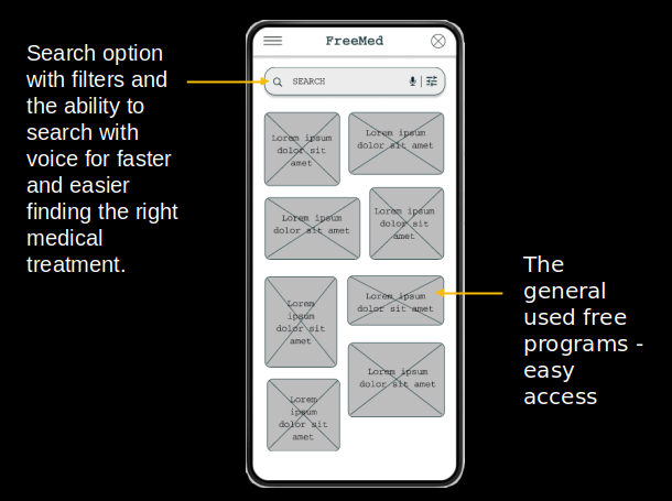
base screen design
After ideating and drafting some paper wireframes, I created the initial designs for the FreeMed app. These designs focused on easy access to finding the right treatment program for the user.
Digital wireframes
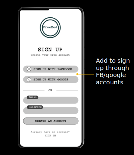
Faster way to create account
Add to sign up through FB/google accounts was a key user need to address in the designs in addition to equipping the app with an easier and faster way to create an account.
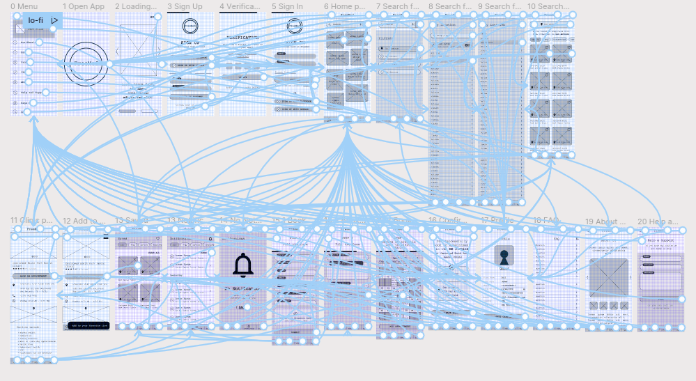
Wireframes for mobile app
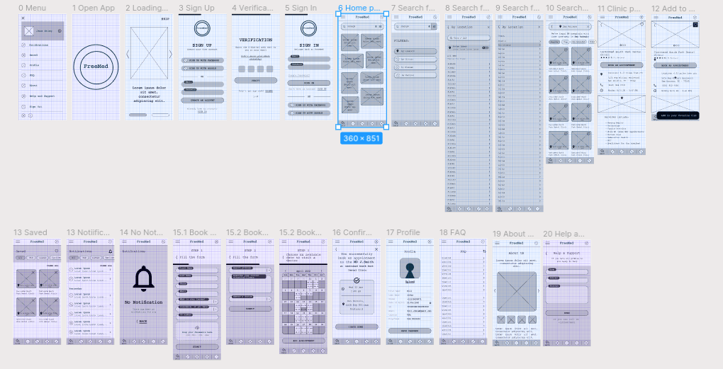
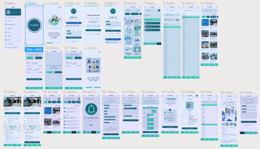
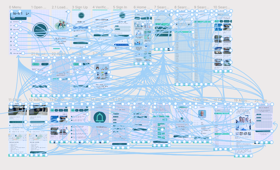
Low-fidelity prototype
To prepare for usability testing, I created a low-fidelity prototype that connected the user flow of search, viewing programs, save them, booking the appointment, read notifications, signin/sign up, about page, FAQ page, account page.
Usability study: parameters
1 Study type:
Unmoderated usability study
2Location:
United States, remote
3 Participants:
5 participants
4 Length:
20-30 minutes
Usability study: findings
These were the main findings uncovered by the usability study:
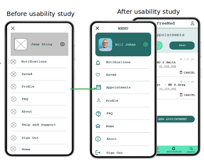
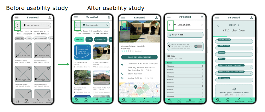
Add Appointments Page
Users need an option to see their booked appointment and edit or cancel it.
Help&Support
Users need clear and easy access to healp and support option.
Back Button position
Users need clear and fixed postion of Back button on each page to easy navigate.
Mockups
Refining the design
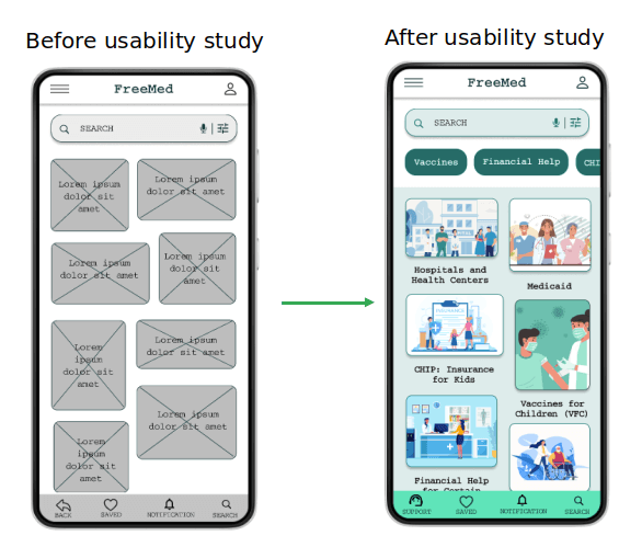
Based on the insights from the usability studies, I applied design changes like adding an appointment page and link to the menu, this helps to manage all appointments in one place.
Mockups
Refining the design
Additional design changes included adding a clear Help&Support option at the bottom menu instead of the back button.
Mockups
Refining the design
Clear and fixed postion of Back button on each page to easy navigate
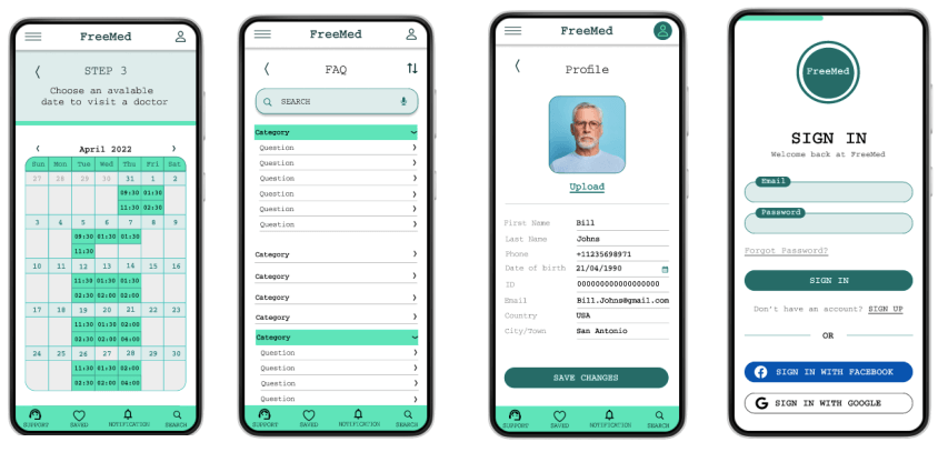
High-fidelity prototype
The high-fidelity prototype followed the same user flow as the low-fidelity prototype, including design changes made after the usability study.
Accessibility considerations
1 Clear labels for interactive elements that can be read by screen readers.
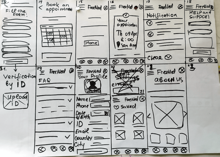
2 Search with the voice option to make it easy to user find their programs
3 I Used headings with different sized text for clear visual hierarchy
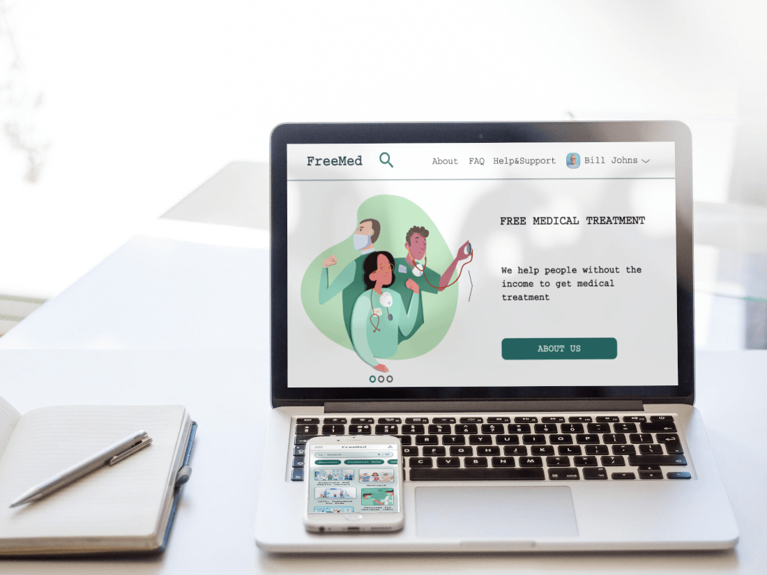
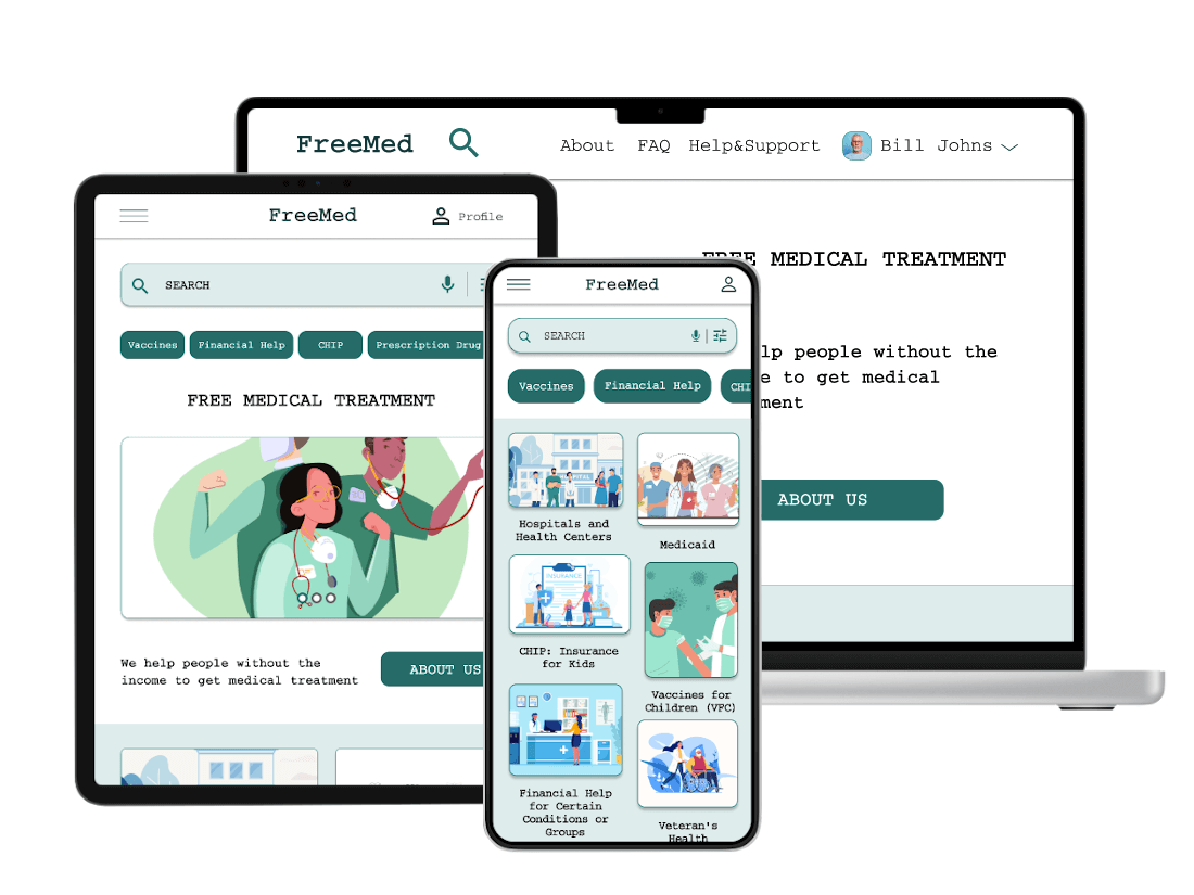
Responsive Design
Sitemap
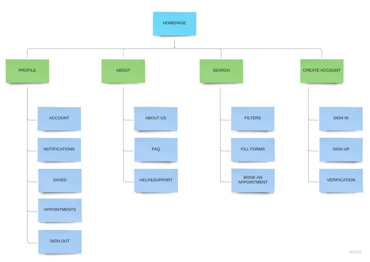
Create sitemap
With the app designs completed, I started work on designing the responsive website. I used the FreeMed sitemap to guide the organizational structure of each screen’s design to ensure a cohesive and consistent experience across devices.
Responsive Design
Responsive design
Mobile devices
The designs for screen size variation included mobile, tablet, and desktop. I optimized the designs to fit specific user needs of each device and screen size.
Check hi-fi Prorotype for Mobile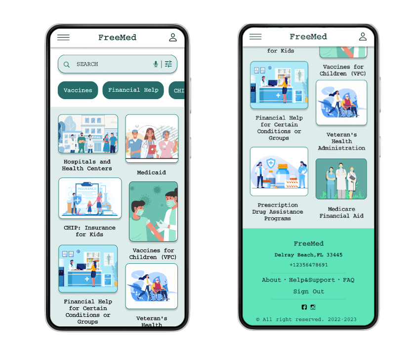
Responsive design
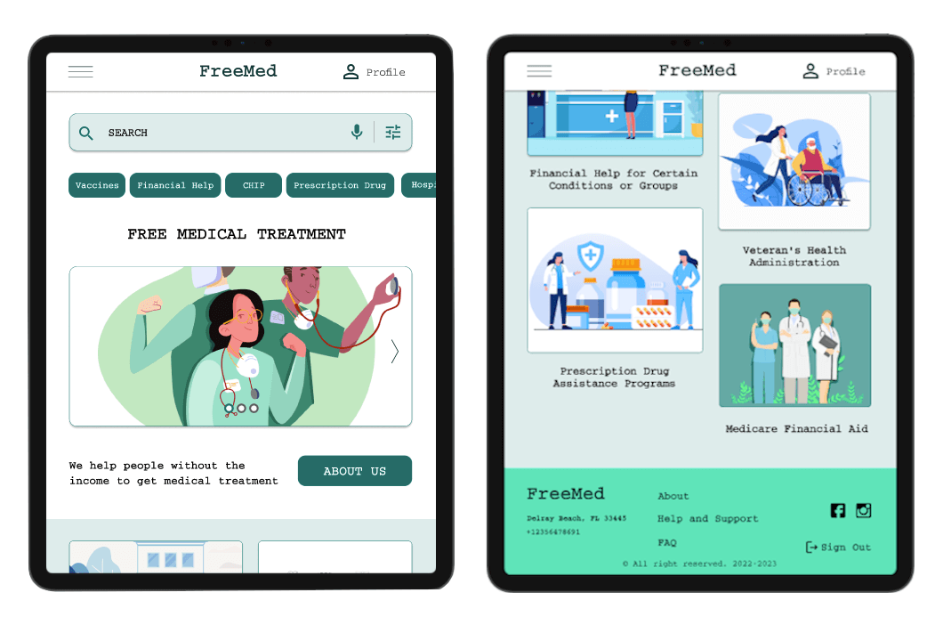
for tablet
The designs for screen size variation included mobile, tablet, and desktop. I optimized the designs to fit specific user needs of each device and screen size.
Check hi-fi Prorotype for TabletResponsive design
Desktop devices
The designs for screen size variation included mobile, tablet, and desktop. I optimized the designs to fit specific user needs of each device and screen size.
Check hi-fi Prorotype for Desktop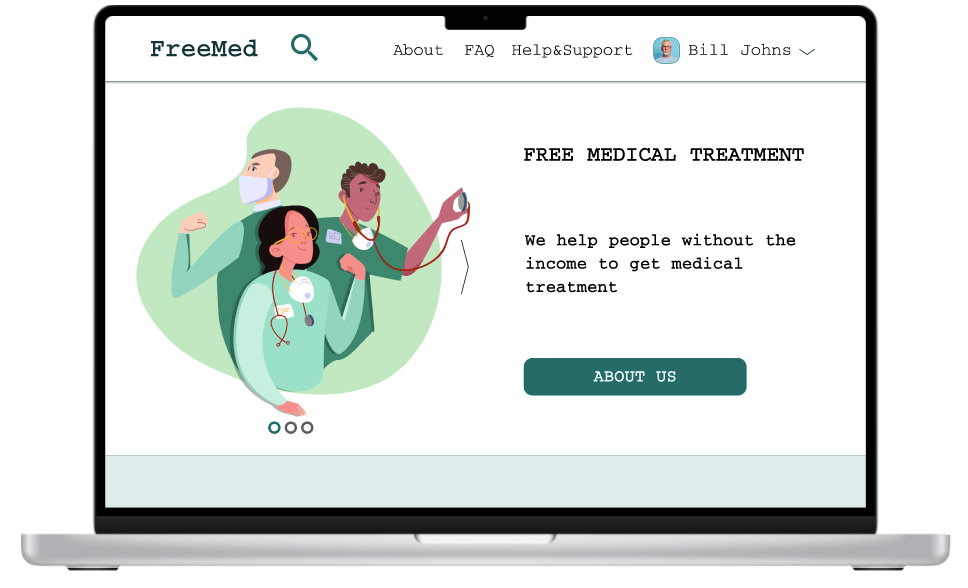
Takeaways
Impact
Users shared that the app is easy to use and navigate. It's really helpful and fast to find free medical treatment at one place from home and book a visit to clinic online.
One quote from peer feedback was that “FreeMed bring faith and hope that trough this app I will get free medical help and this will help me with my health."
What I learned
I learned that design has a great impact on people lives and even small things can defenatly improve their lives and user experience.
Gather all free medical programs at one place and give the opportunity to book an appointment to doctor online is giving people with desices a lot of hope and staraignt their faith in the feature.
Next Steps
1 Conduct research on how successful the app is in reaching the goal.
2 Identify any additional areas of need and ideate on new features.