Project Overview
The problem
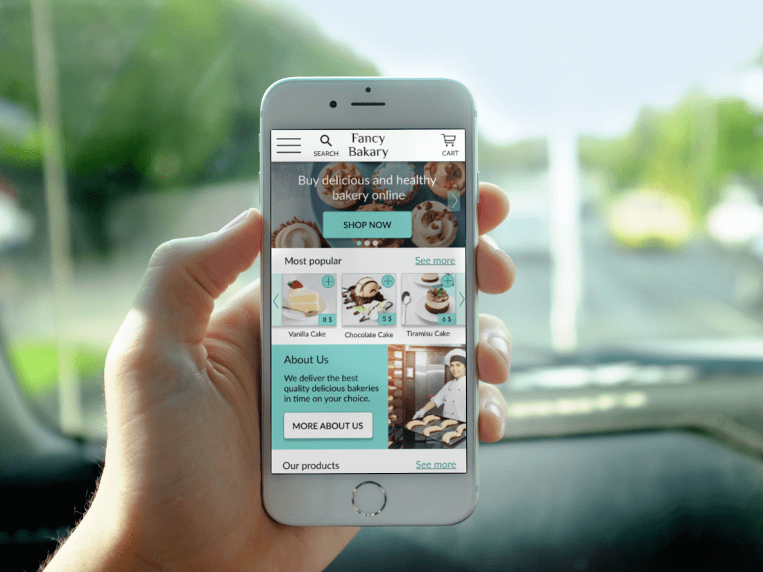
Busy workers and customers lack the time to choose and buy at a bakery shop offline, and also to prepare bakery goods at home.
The goal
Design an accessible app for Fancy Bakery that allows users to easily order and fast receive fresh baking goods.
Summary
User research
The main goal of my user research for designing fancy bakery app was to empathize with our users, find pain points and practicall approach to solve the problems.
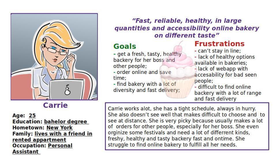
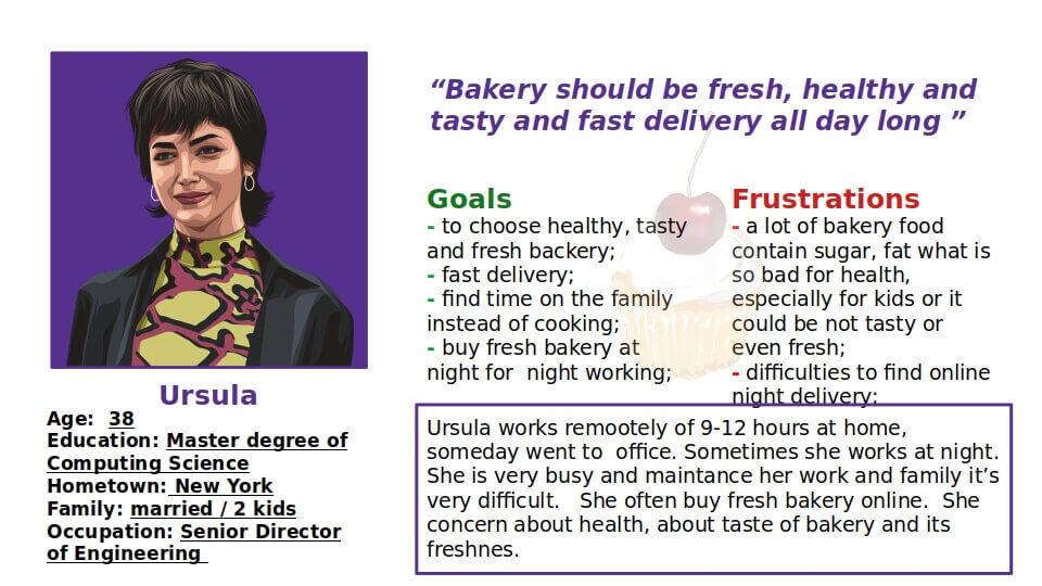
After conduct foundation research and gathering data through interviews to learn about users I'm designing for, their thoughts, experiences and feelings, I found that a lot of users have a problems with ordering online, delivery process, creating account and some needs to be able to use accessible features. But the main point it was bakery should have tasty and healthy variaty of goods, fast deliver all day long and special program for special customers.
Pain Points
1 PROCESS ONLINE ORDERING
Users pointed that they found it a bit “hard” to find an app where they could easily order online without a long process of registration
2 APPS ACCESSIBILITY
Users struggle to find an app with accessibility features
3 DELIVERY
Difficult to find fast delivery and all day long
4 QUALITY OF PRODUCT
Many users pointed that quality, taste freshness and healthy of product are the main value of their choise.
Persona: Carrie
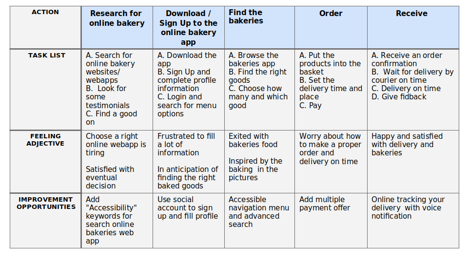
User journey map
Goal: Accessible online bakery with a lot of range and fast delivery.

wireframes
Paper wireframes
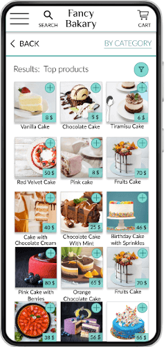
Taking the time to draft iterations of each screen of the app on paper ensured that elements that made it to digital wireframes would be well-suited to address usrer pain points. For the home screen, I prioritized a quick and easy ordering process to help users save time.
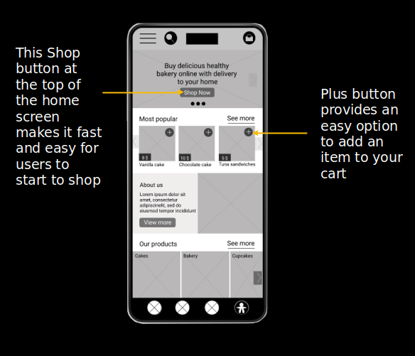
Digital wireframes
base screen design
As the initial design phase continued, I made sure to base screen designs on feedback and findings from the user research.
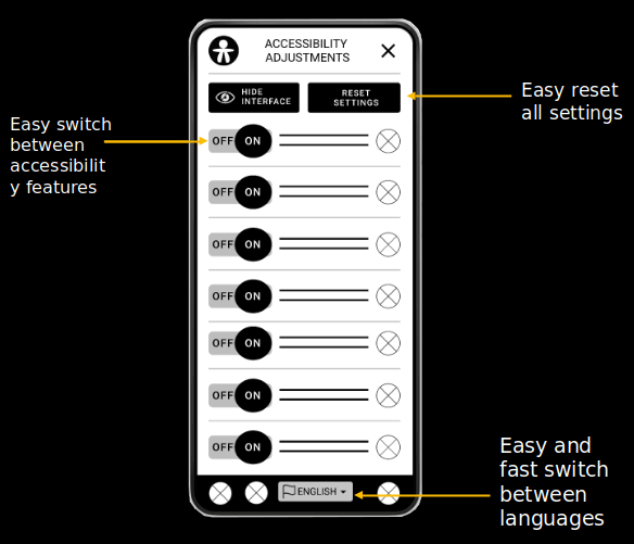
Digital wireframes
accessibility adjustments
Adding easy accessibility adjustments was a key user need to address in the designs in addition to equipping the app to work with assistive technologies.
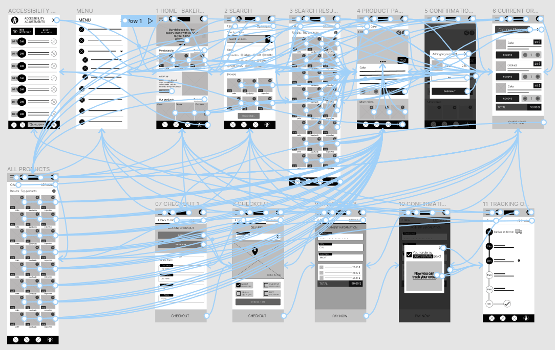
Low-fidelity prototype
The low-fidelity prototype connected the primary user flow of finding and ordering a bakery goods, so the prototype could be used in a usability study with users.
Usability study: findings
I conducted two rounds of usability studies. Findings from the first study helped guide the designs from wireframes to mockups. The second study used a high-fidelity prototype and revealed what aspects of the mockups needed refining.
Round 1 findings
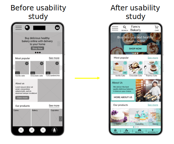
1users need more detailed accessible icon with title and help option near it
2users need more clear titles for buttons, and intuitive links on it
3users need more information and less steps for checkout process
Round 2 findings
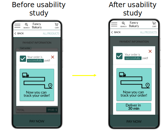
1users needs time information in Confirmation popup
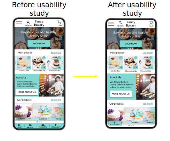
2users need less overwhelming menu
Mockups
Refining the design
After usability study, I added text under accessible and menu icons with titles, make clear titles for buttons, and intuitive links on it
Mockups
Refining the design
The second usability study showed that users needed time information for Confirmation popup.
Mockups
Refining the design
Also, the second usability study revealed frustration with the overwhelming menu. I change the bottom menu just on the accessible adjustment icon.
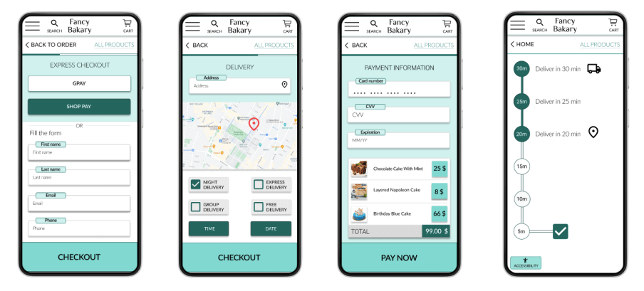
High-fidelity prototype
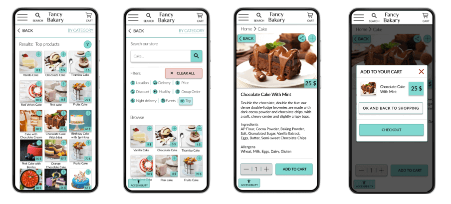
The final high-fidelity prototype presented cleaner user flows for order and checkout online cakes, pastry, sandwiches, and other bakery goods. It also met user needs for delivery options and accessible features.
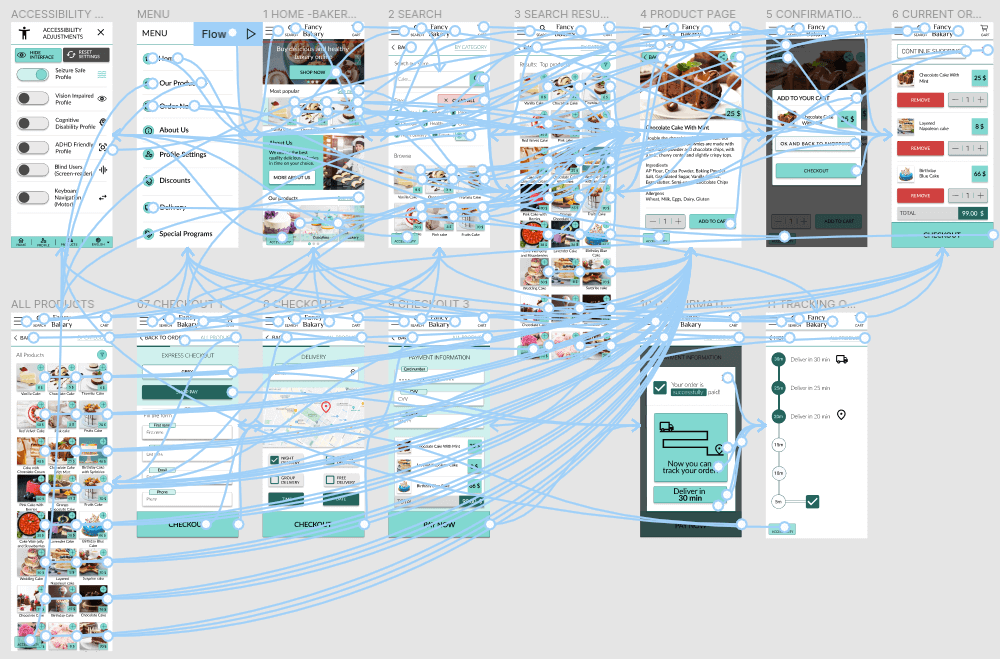
Accessibility considerations
1 Provide access to users who are vision impaired through adding alt text to images for screen readers
2 Used icons to help make navigation easier.
3 Used accessible feature adjustment for vision impaired, cognitive disabilities, blind users, and other settings
Takeaways
Impact
The Fancy Bakery app is accessible and easy to use app for order and fast receive fresh baking goods.
The quote from peer feedback: "I would definitely use this app to order delicious cakes, bakeries, and other goods. Easy to use and order!"
What I learned
I learned that our vision of design is not always the same as user needs and experience.
I should always consider and prevent my biases, empathize with users, design inclusive and accessible. My design should help to improve user flow and user experience, make it efficient by using all learned design systems and methods from the product development life cycle.
Next Steps
1 Conduct another round of usability research to validate whether the pain points users experienced have been effectively addressed.
2 Suggestion for future research might be to include a broader sample ( more study participants ), creating more personas and researching available secondary data.
